Right, this is one of those posts where I wish an actual expert would talk about this, but I’m not finding what I want an expert to have said, so I’ll do my (admittedly non-expert but at least experienced) best.
Go to the Google search page.
There is a lot of white on that page.
The white is negative space, which, on a literal level, sounds like an oxymoron.
What the term means, though, is that there is space that is not filled with something. Postive space = stuff; negative space = just regular old space where stuff could be but isn’t.
(If you want to see some cool stuff, look up “drawing negative space,” which is an artist trick to teach people how to stop seeing “chairs” “flowers” and “cats” and start seeing pure shapes and forms. Want a stupid fast way to learn how to draw? Look up how to draw using negative space.)
When you are making a cover, you need to pay attention to negative space for several reasons:
- So you have room to put your text.
- So the cover isn’t overwhelming.
- So the cover fits genre expectations.
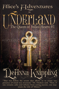
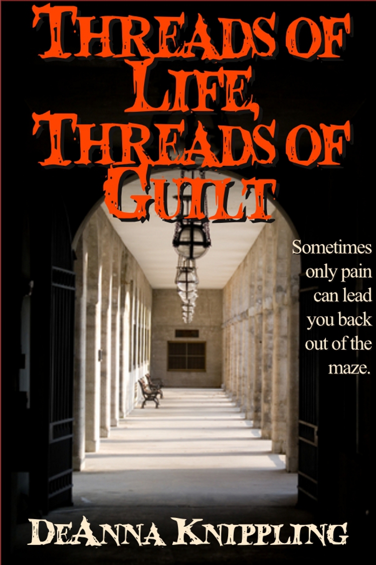 Here’s one of my earlier covers. Let’s call it an example of poor use of #1, leaving enough room to put your text. (There are other problems.) The title, for no apparent reason, simply must spill over the image, because…I don’t know.
Here’s another cover. Let’s call it a bad example of both #1 (leaving enough room for the text–look at that perfectly unreadable author name) and #2, OMG THIS COVER MAKES MY EYES STRAIN. The darks are so dark that you have to work in order to find out what’s going on there. Those of us with astigmatism are struggling to read the text anyway, it’s so smooshed together, and combined with the background, it’s just too much.
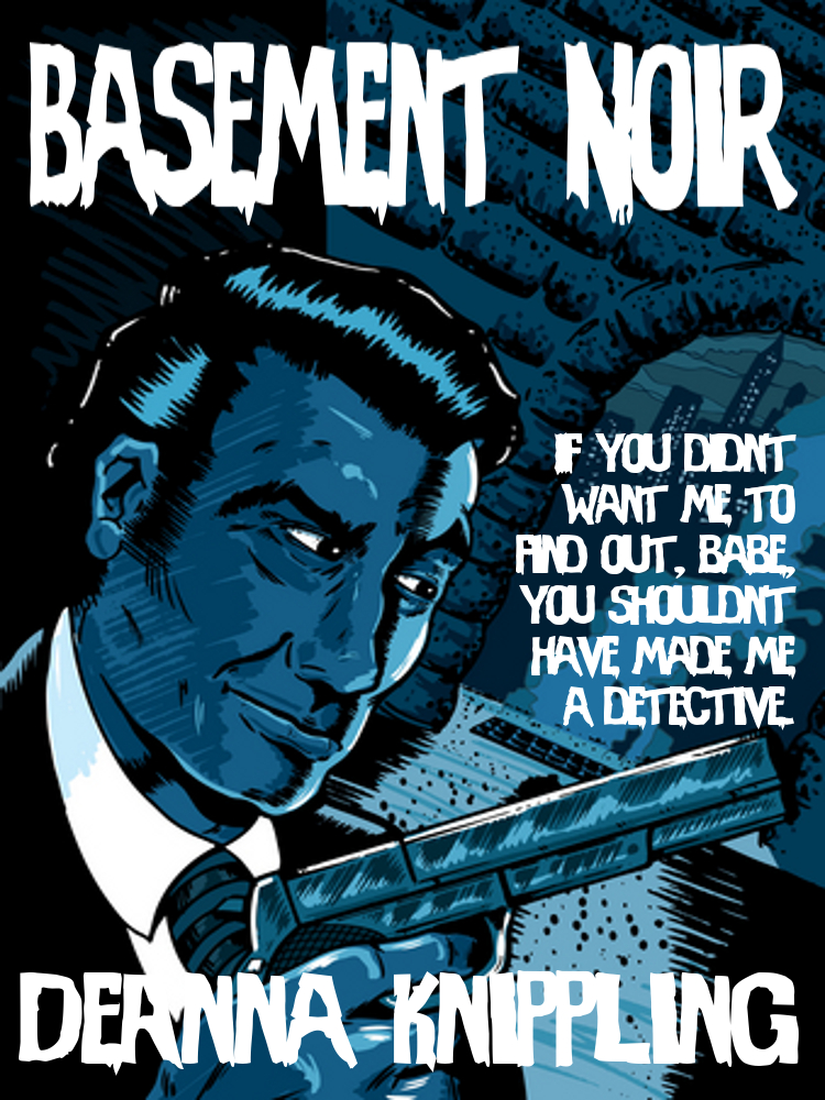
And here’s a great example of #3, which makes you go, “What the hell genre is this?!?” Plus it’s very wearying on the eyes.
Here’s a better example of the same genre, although I would do a few things differently on this cover now (like adding an author tag and a title tag, if nothing else).
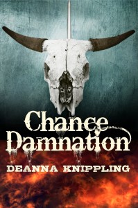
Notice something about this cover? It’s not nearly as busy. Stuff is not just shoved onto the cover willy-nilly. There’s space.
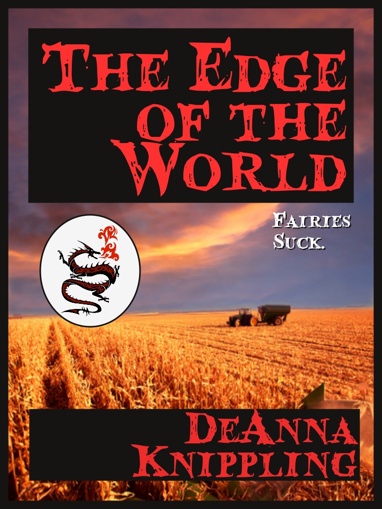
The “The Edge of the World” cover has multiple text boxes, the weird little dragon logo, the farm stuff, some kind of bright streak of clouds…dude, you have no idea where to look.
The Chance Damnation cover has fewer elements; this makes each element more attention-worthy and striking. There is room around the skull. The flames aren’t filled with sixty attention-grabbing demon heads. The text has room to breathe (and the letters aren’t all smooshed together). Maybe not the best cover in the world, but worlds better than “The Edge of the World.”
And it matches the horror genre, not just in the content of the images, but in their use of negative space.
Scroll through a list of horror books, and you’ll see a lot of negative space–mostly black. More recently, you’ll see some horror books using white negative space, or fairly faint patterns that blur into negative space when you see the book from a distance. This is one of those areas where you can break the rules when you understand them well enough, of course.
So when you’re looking at your comp covers, also look at how much stuff is on your comp covers.
You do not need to put all the stuff on your cover (well, unless you’re writing high fantasy maybe, and even then you get nice spacious covers like the GRRM covers, or a historical romance, and even then the better covers at least make the dresses big enough and uniform enough that you can use them for negative space to drop your text into).
I’m still getting a grasp on the idea of not having to put all the stuff onto a cover. It’ll take years to really get a sense of restraint, I think. But, as Laura Harvey once told me, “A classy woman looks at herself in the mirror before she goes out and takes off one last piece of jewelry.” (That may not be the exact quote, but you get it.)
I already took a bunch of “jewelry” off this cover, and still I can see one more that just bugs me and I should really take off. Maybe two.