I used to work at Wells Fargo in the Home Equity department as an auditor, so I had to learn the process backward and forward so people didn’t call me out for dinging the wrong things. Fair enough.
One of the things we did was look over appraisals. In the appraisal, there were usually 3-5 “comps” listed–“comparables.” One of the ways the appraiser would determine the value of your house is through the comps–House A is like your house, except it has a jacuzzi. House B is like your house, except your house has a newer roof. House C is like your house, except the front yard is xeriscaped. And so on.
I’m no expert on appraisals. I knew just enough to help me audit.
But I use the idea all the time with my publishing clients, especially the cover-design clients.
A caveat here: for those writers who are building houses (as it were) in strange locations, this works for you, too, and I’ll throw you a bone later. But I’m gonna start with the people who write more normally niched things.
Genre = Neighborhood
The first thing a book cover should do is tell you the genre: genre, when it comes to selling books, is your “neighborhood.” You don’t want to put your book in the wrong neighborhood–because then nobody will buy the book. Imagine a 17th-century villa in a suburban neighborhood.
People will drive by the house to gawk at it, but they won’t buy it.
Now, if you’re living solidly within a genre, the best thing you can do is to figure out how to appeal to readers who will read pretty much anything good in that genre. If you’re writing a book with tenement apartments and tragic stories behind every door, you don’t want to plunk the thing down on Lovers’ Lane. Whoops! The Lovers’ Lane people sometimes sneak out to have affairs at the tenement, but when they do…they go to a tenement-building kind of neighborhood to go find them.
So you want your book to look like it belongs in the right neighborhood.
How?
Make it look like the other books in that neighborhood, but with enough intresting details to stand out individually.
Your designer will be doing a lot of this, especially the “interesting details” part. But you, the writer, should be doing some research on what the other books in your neighborhood look like.
Why?
- To help you refine your cover ideas.
- To give you a non-jargony language with which to talk to your cover designer.
- To help you make sure your cover designer is including everything that should be on the cover.
- To help you assess how well your cover designer is doing.
Let’s say you wrote a YA book about a girl who finds out she’s a were-jaguar. Your first instinct is to tell your cover designer, “Well, put a girl turning into a jaguar on the cover.”
However, when you get the cover design back and put it up on Facebook to hear the adulation of your friends and family, they say, “But that looks like a kids’ book.”
You painfully explain that it’s young adult, and that it’s for older teens, etc., etc., and they say, “Yeah, I know what young adult is. What I mean is, it looks like that Animorphs series.”
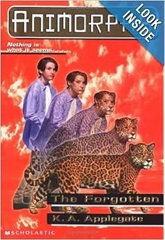
If you don’t know Animorphs, it’s not YA, it’s middle-grade–for 9-12 year olds–about kids who turn into other forms. Oops! You just moved into a neighborhood full of 10 year olds! The 16 year olds will never see you, and the parents of the 10 year olds will burn you alive for your raunchy middle-grade book.
Now, if you research the covers in your genre, you will see that YA books in the F/SF area tend to have bold titles with more text than image. Certainly nothing that looks cartoony (unless it’s humor). Lots of sigils on the dytopian fiction. Lots of futuristic setting on the SF. Lots of clockworky setting on the steampunk. Lots of people showing some skin on books with an emphasis on romance. Verrrry dramatic stuff. Lots of attention to the fonts, just a like a teenager scribbling on their notebooks.
Which neighborhood should your book move into? Well, let’s say your jagura girl is all about the romance.
Why not something like one of these?
![]()
![]()
![]()
![]()
When you have 3-5 comps to work with, then you can:
- Give your cover designer some options for images, fonts, and layouts that will probably not be so far off the mark that you absolutely hate them.
- Tell your designer what’s popular.
- Be able to say, “I want a font like Beautiful Creatures, but more of a PC Cast picture, but with the title across the middle like on Teardrop.” And the designer will get it.
- Be able to tell your designer, “No, the cute little picture of bunnies and kittens does not fit the genre, even if there is a scene with a cute bunny and kitten in the book. Your cover doesn’t look anything like the comps I sent you.”
Okay, back to the people who are playing around with genre:
What you want to do is explain that a) you’re playing outside normal genre territory, and b) promise the reader an emotion (you want to do this because normally genre = the major emotional promise of the book; if you’re going to fudge the technical genre, you need to nail the major emotional promise).
![]()
This particular cover shows a) that two different genres are being combined (fantasy and Western), and b) that it’s going to be both serious and silly.
I highly suggest pulling comps in at least your two main genres (3-5 for each) and starting from there. Your task throughout the writing and publishing process is always going to be more difficult, but quite possibly more satisfying as well.
You are writing for the audience that loves the villa in suburbia, so you really ought to show some kind of incongruity on the cover.
(If you’ve ever bitched about traditional publishing not knowing how to market cross-genre books, well, it seems like indies are figuring it out, and here’s evidence.)
—
Now, I’ve been mostly talking in terms of cover design, but comps are important across the board for a publishing project.
They tell the publisher:
- How to communicate genre/subgenre on the cover.
- What the interior design should look like.
- What the editing should look like (e.g., “It’s a steampunk. Don’t define the acronyms in the flow of text like it’s a James Bond novel!”).
- What the back cover description should read like.
Finding comps will inform your team of what elements have to be a part of your book, and it will help you explain what’s wrong when things go wrong. It can even help you break rules (“Look, I know this is a were-jaguar YA, but it’s a funny one, so I need some Unicorn Western mock-seriousness in it, okay?”).
So before you send out your book–whether to traditional publishing or to a designer/editor, pick your comps!
First, the new design rocks! I love, love, love how clean it is. Your writing really shines, which is important because you write some kick-ass posts.
As always, this is super timely for me. I’m working on tightening my catalog and making sure all of the books are branded appropriately. I’ve been playing with cover designs, making sure the typeface for the author name matches across all titles, and that the mood of the cover is right. I love your comparison of books to houses! It works really well. 🙂
Thanks! I need to figure out how to tweak this layout, though. I must like it. I just want to fuss with it.
I like the idea of being that specific – I just have to figure out what the comps are for a mainstream ‘novel of obsession, betrayal, and love’ (my subtitle for Pride’s Children).
When I have the energy, I go look at things like Romantic Times choices or mainstream novels on Amazon, looking for a cover ‘type’ or ‘look’ – but I haven’t figured them out yet. I intend to ask my readers (I’m posting the novel a scene at a time as I polish it, each Tuesday on my blog) what other things they like to read, and what PC reminds them of – so many decisions. It isn’t a category romance, so I also want to avoid implying that – almost as important as telling what it IS.
When I get frustrated, I go write instead. I know my story – but don’t know anything else quite like it.
Thanks for the advice – now I have words for what I’m doing: looking for comps.
Alicia
Hm…are you sure the novel’s a mainstream? I go, “But that sounds like Gone Girl,” and that’s Suspense. I guess it depends, doesn’t it?
Nice post, DeAnna!
I had a lot of fun working on cross-branding (with my awesome cover designer) the science fantasy YA elements in my newest release, SPARK http://antheasharp.com/2013/12/14/spark-2/.
High-tech computer gaming meets the Realm of Faerie. I think we did a good job, down the the SF font with the fantasy swirl. Would love your opinion! 😉
-Anthea
Anthea – back atcha via email.