So back in January I entered an indie cover art poll, and didn’t win (no surprise there). However, I’d like to take a minute to break down the covers there…
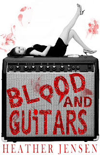
Blood and Guitars – Heather Jensen
Very designy cover, a cutout on a white background. It has good contrast, even at small sizes. Genre seems fairly obvious: paranormal romance, with guitars. However, the picture has a white background, and the cover has no border, which makes it hard to view on a light background.
Flame of Surrender – Rhiannon Paille
Full-image background. The lettering has poor contrast, especially in B&W, and the fading from the decently-readable light purple at the top of the letters gets darker toward the bottom–combined with the smaller type under the word “Flame,” I had to force myself to read the whole title. The background is too busy to pull off the lettering as such. The picture is striking enough (I rather like it), but it makes me think, “This had better be tree porn,” which wasn’t the impression I picked up from the description on Smashwords. The genre is clearly some kind of romance + fantasy combination, but I don’t really get a feel for it. YA or not? I thought it was more YA, but when I checked out the genre on Smashwords, it’s in the non-YA epic paranormal fantasy categories. I’m not sure how fantasy can be both epic and paranormal.
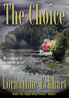
The Choice – Lorhainne Eckhart
Full-image background. The font’s not all that and a bag of chips. The 3D dimensions on the font make it harder to read (and somewhat cheesy-looking), but the font’s well-placed over non-busy areas of the background, and it’s big enough to read the important bits, although the author name is almost too small to be readable at a smaller size. I get a sense of a fiction story with very small elements of the supernatural in it (almost, but not quite, magical realism). I also get a sense that this story might be very “cute,” with a sentimental ending (the pink house is the only thing in color). The book’s listed as a detective novel and as romantic suspense on Smashwords.
Image-on-colored-background. The font contrasts well, is large enough, and is easy to read. The image is striking. This strikes me as a very eb00k ebook cover, if that makes sense–something that would look cheesy as a print cover but works well as an ebook cover. I want to say this is a thriller, something like that movie with Harrison Ford among the Amish…I looked it up: this is a thriller, but a science fiction thriller. Wow. I did not pick up on that at all.
Full-image background. The font’s not quite big enough–imagine what this would look like with a more solid white font without the black borders on the letters. Fat, white letters with no serifs. It would scream horror thriller. Or, alternately, if the letters were wider, still thin, but stretched longer, vertically? The font just looks too normal for the genre. Background: fantastic. I’m thinking of picking this up. Smashwords says this is a Horror/Undead book. Right up my alley. Downloaded sample for Nook…as a beginning cover designer, I would take this as a note that if you communicate the genre well, other elements that are less than ideal may pass more or less unnoticed.
Disclosure: I know the author and have read a draft of the book. Full-cover background. A good example of making tradeoffs and breaking rules. At thumbnail size, you can’t really read the text, but the image is so striking (and that “K” becomes a “WHAT THE HELL IS THAT UNDER HER EYE PLEASE NOT A SPIDER” moment) that it almost sucks people into look at it despite themselves. Does this cover scream YA to you? Also, no. But it screams, “This is a book about an intense character.” No demure maiden here. The cover works even though it doesn’t fit the “rules”: keep that in mind. If you find yourself simply having to look further at a book blurb or a sample with no other reason than the cover, it works. The cover for Twilight, for example, also doesn’t really give a hint about genre–yet it’s so striking that you can’t help but look further (I certainly couldn’t, when it came out, but didn’t get past the sample. I kept picking up the book, hoping that somehow it would be a book for me–due to the cover. That’s how good the cover is.) The only thing I’m utterly blah about on this cover is the series title. Every time, I read it first as “Allie’s Book War One.” The design isn’t enough to offset 30-plus years of reading from right to left.
Full-image background. I feel the title should be the most readable thing on a cover, unless you’re a big-name writer. Because the black font fades into the background, the most noticeable words on this cover are the tiny author’s name. The shadowing behind the title font makes it even harder to read (to my astigmatism, it seems to vibrate). Overall, the cover is just too dark without enough bright points–having the title font in a brighter color would take care of that, though. The dark shapes in the image would be a lot more interesting if the background were a lighter color, too. What genre is this? I have no clue. None. This book has no appeal for me, because I have no idea what to expect. Smashwords reports the genre as historical fiction. Hm…I’d say, give it a font that looks somewhat historical, brighten up the picture while retaining contrast, and add a border that reflects the period on the outside, and sales would go up. IMO.
Legends of Green Isle: The Forgotton Spell – Constance Wallace
A very designy cover, with mixed elements. I don’t know where to look on this cover. The title isn’t the most important element, I can’t read the font clearly (and the 3D stuff just makes it harder), I can’t tell what the picture in the middle is at first glance, I can’t tell what’s in the white space, and the lack of symmetry in the block for the author (with a whole lotta white space) just makes me feel lopsided. But I can tell the genre as soon as I can figure out what the picture is, so it’s not a waste of time and probably moves books relatively well. What age group is this for? Adult? Smashwords reports this as a YA fantasy, but I’m just not picking up on YA. Note: the Amazon cover is simpler and doesn’t look as designy–but it communicates better.
Agents of Change – Guy Harrison
Full-background cover. This one won the contest. Dude. There is not a dang thing bad I can say about this cover. My only quibble is that this is an adult thriller, and the chick in the image to the back looks YA-ish. This isn’t the book for me, because I’m not a thriller reader, but I can tell that at a glance. And if I were a thriller reader, I’d know that I’d have to at least read the sample: that’s what you want from a cover, to get people to read the blurb and a sample of the book. Even the shading on the lettering is subtle and effective. This is a better thriller cover than most professional thriller covers, and would work well as a print cover, too.
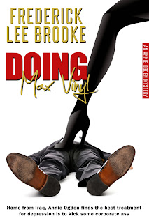
Doing Max Vinyl – Frederick Lee Brooke
Very designy cover – cutout on white background. Okay. Something about this cover took real guts. What is it? There are several ways in which the designer walked right up to the edge of “the rules” but didn’t quite break them…and one way in which the designer said, “I’ve heard about that rule. Fuggeddahboutit.” The font is almost 3D. The title is almost too hard to read. The title against the background (that skinny leg) is almost too hard to read. The image screams this story is about a chick who gets revenge. Or maybe it’s a fetish book…but the contrasts seem too violent to be pure kink. No, upon reading the tagline at the bottom of the cover, I have to say this is indeed a revenge book. Okay. Got it yet? The name. This is a book for chicks written by someone who admits to a masculine pen name. I say more power to he author. However, next time put a black border around the cover, so the image doesn’t fade into light backgrounds. And the Amazon print cover? Is even just slightly funnier than the ebook one.
…sadly, I ran out of time (and my book is the next one on the list, and I’m still not distanced enough to be able to talk about it). So more covers later. Dear authors and cover designers, I know our jobs are hard ones, and I don’t mean to offend; these are just my impressions. Feel free to respond 🙂


Your comments echoed mine (or pre-echoed mine) as I looked at each cover. A few others:
“Blood & Guitars” – Love this cover. Bold, easy to read, striking. Hate the fangs on the word “Blood,” though — should have worked on them to make them look more “natural” rather than (intenmtionally or not) amateurish.
“Flame of Surrender” – Tree porn. Yes. Also, there’s no point in a series title if it’s too long and frilly to be readable at the size you’re putting it in .
“The Choice” – Disliked the font a lot, but this *could* be a real paperback-on-a-spinner cover.
“Blind Veil” – Loved the eyes and the font, but didn’t get diddly from the buildings.
“Rook” – I read the top text the same way (though I used the old *left* to *right* rules …)
“Legends of the Green Isle” – Looks like an RPG expansion book.
“Doing Max Vinyl” – I would have significantly increased the point size of “Max Vinyl” to make it readable and balanced.
Actually, overall, I’m impressed by a lot of these, more than I would have expected.
There are ton of excellent indie ebook covers out there right now. It ups the ante 🙂
I thought that Blood and Guitars didn’t really need the fangs on the os, but eh. Not much harm done.
Heh. Left to right. Riiiiiiight.
Btw, I thought the series name in “Doing Max Vinyl” worked quite nicely — it was there, it was visible and findable but it didn’t clutter things.
(I also like the very different but thematically similar Amazon cover. Have to wonder why they are different.)
I’m not as hep on having white covers needing a border. In the comic covers I do on my podcast posts, the white covers “blend” into the white background, but that’s not always a bad thing — it can make the imagery and text stand out more.
On the borders – sometimes you want them to blend in; my cover for “Abominable” is white and has no border – but it’s a story about snow, so I think it makes sense. But the covers here, it’s not clear that it’s part of the design, so I rather think it’s not deliberate.
Thank you for your viewpoints. It is always nice to read honest opinions.